17 March 2013

My First Blood Angel - The Army Begins

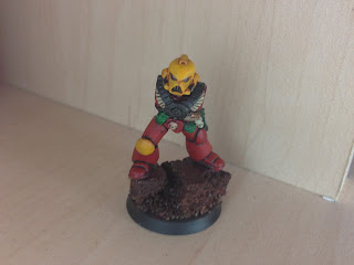
So, here's my first Blood Angel army member.  The picture in my previous blog entry was of a different body and stance which I decided to use for my currently un-owned Devastator Squad.  I just figured that as the Tactical Squad are basically the 'runts' of the Blood Angels army, the very generic eagle body armour and classic space marine beak helmets would therefore make for a better choice.

I am pleased with this figure overall, my only gripe is that the tones and overall finish of the model have been lost with the quality of the photographs.  The lighting has made the red look very uniform in colour and much brighter than it is in the flesh.  Anyway, this is a painting blog and not a photography blog so rant over (although a light tent and day lamps would be tempting as the army evolves....mmmm)

This Assault Marine took all the techniques detailed in my 'style found' notes and replicated them exactly onto the model.  As a side point, I'd tried to make the gun look more metallic with a wet brush technique but as the gun and head are the main focal points, it wasn't in-keeping with the painting style of the rest of the model and detracted from the miniature itself.  A quick tidy-up later of a plain black basecoat with selective silver and gold applications and it shifted the eye's focus back onto the armour once more.  A very basic paintjob to say the least but it just somehow works.  I'm still very undecided on how the base should be tackled.  I'm tempted to make the cork look like grey rocks with a dark brown mud floor and grass tufts but they can be added later.  Watch this space.

A real milestone here as it's the best space marine I've ever painted and has kick-started this blog.  I'm going to have a break for 2 weeks as I'm on holiday but £200+ of Blood Angels will be waiting for me upon my return and the real collection of the army begins.  In addition, I've also ordered a couple of Orks just to experiment with different colours and painting techniques to try and broaden my skills.  Again, being red/green colour blind makes this a rather ironic army choice to be painting.  Thank you to Games Workshop for creating all the correct tones for me.

The first Blood Angel troop in my army, I could shed a tear.
Let's call him Bob
The back of Bob.  Making the most of a shoulder pad I
had originally purchased off ebay with a few other plastic parts

16 March 2013

Style Found! (at last)

Ok, so here it is.  The combination of more subtle contrasts between paints, washes and highlights appears to have come together nicely.  The wash of 50:50 brown ink to water has worked very well and the use of Evil Sunz Scarlet as the edge highlight against the Memphiston Red basecoat sets the model off effectively.  Subtly is definitely the key in order to keep the colour gradients and transitions smother.

I have basically found that a white undercoat (2 thin wash layers) with about 3-4 thin applications of Memphiston Red, leaves a very smooth and even base colour.  The model was then washed 50:50 with Brown ink/water mix.  A 1:1:1 mix of brown: black: water mix was then carefully and ONLY applied into the deep recesses where the shadows fell.  The thin brown:water wash did leave white areas in a couple of places which needed tidying up.  The picture below was taken just before I added the darker wash mix and helps to illustrate the point.  Thin layers of Memphiston Red were then applied to the armour and slowly pulled closer to the edges where the eventual edge highlights would appear.  A thin edge highlight layer of Evil Suz Scarlet was then carefully drawn on the edges of the armour.  Where slightly thicker lines were created by accident, a few passes with Memphiston red soon restored it back to how it should be.  With regards to the black areas on the knee and arms joints, just use 1 or 2 thin applications of Abaddon Black.  I found that a pure black area with grey highlights didn't work, the contrast was too strong for my liking.  Notes to self, paint must always be thin and flowing nicely off the brush.  Patience and subtly is key.

Looking forward to completing the rest of the model now and sticking it all together.


Plastic Fantastic!

The new plastic kits!

The moment is here, I now have a box of Assault Marines and the Codex in which to hone my skills and also keep the miniatures in their official colours.  The Codex is also a great reference for some kit-bashing conversions to try and make the models a bit more individual than continuously repetitive ranks of troop choices.


The Codex.  A perfect reference point for colour schemes
and kit-bash ideas

Assault Marines.  Ready to be hit hard by my brushes


Notes from my first impressions of painting the plastic medium:

Style still trying to be found....

Here we have another attempt but this time, I've committed to the plastic models.  First things first, plastic models are wonderful to paint.  The colour just flows over the model so smoothly and evenly, instantly giving a clean, crisp, layer.  I've learnt that 3-4 thin layers of red really gives a much better finish and is worth the extra bit of time.  The shame is, I got a bit too brush-happy with the washes and made it too dark and cloudy.  This model had 3 washes in total.  I'll try two next time.  The effort to then rectify the situation with re-application of the basecoat and then progressive highlights just didn't work.  The wash was too dark and the highlight colour was too light.  Orange just doesn't work against the dark wash.  This model was coated with a 50:50 wash of brown:black ink.  I've halted progress here and will put this model down to wastage.  The next one will have a 1:1:1 mix of brown:black:water.  The highlight will also be Evil Sunz Red as opposed to Troll Slayer Orange.  On a plus note, I really like how the gold is set-off against the red.  I'll try and make the next model appear as though the emblem is made of bone and see how that looks with the plastic model detail compared to previous efforts on the metal casts.


My first attempt at plastic and a few things
 learnt to improve on the next one


Okay, I think I'm getting there now with this more realistic/cartoon style balance.  With this model, I applied the mix I previously suggested of a wash of 1:1:1 of brown ink: black ink: water.  I do like it but the edge highlights still contrast too much with the standard colours of the armour (test area done on the back).  The chest plate isn't finished but I prefer these being gold.  I'll reserve the bone effect for the Death Company models.
One more effort will be made today with a 1:1 wash of brown ink: water.  I think this'll be perfect for the realistic/cartoon balance I'm after.   Although the style below is rather gritty looking and there's probably nothing wrong with it, I still feel the armour colours could be that touch more brighter and permit the edge highlights not to look out of place.

A technique that has worked particularly well on this model is just applying one wash and then selectively re-applying the wash only onto areas which will typically fall into shadow i.e behind the knee pads and around the feet.  This method will definitely be used from here-on.

Close but no cigar

04 March 2013

The Expendables - Finding My Painting Style

On taking my friend's advice to collect plastic miniatures, I have decided to buy a few cheap models off ebay to practise my painting techniques before letting myself loose on the new kits...

The Expendables

A wider selection of Citadel Paints

Below is my second attempt at painting, this time on an Assault Marine.  It's not finished but it has enabled me to practice the basecoats and washes.  I think the wash on the helmet is far too dark and makes it look dirty.  My next attempt at yellow will probably use a Sepia wash or maybe even a yellow wash I have seen on the Games Workshop website.  I'll give it a shot on another 2 or 3 metal miniatures before I man-up and commit to making my best effort on a box of plastic miniatures.  

Blood Angel Assault Marine - painting technique test

An attempt has also been made to try and highlight the armour on his leg.  I feel the contrast is too obvious and will have to try and find a lighter coloured red as opposed to using orange for the edge highlights...  I'm also thinking this Memphiston Red is maybe too dark for the basecoat colour and that I need to get a decent camera, I just couldn't get this focus close enough without blurring.

Blood Angel Assault Marine - armour highlighting attempt


Another quick attempt.  Just testing out the blue colours and wash, together with more effort being placed on the bone chest emblem.  Next stop, plastics!

Small improvements being made all the time and a chance to
test the blue paints on this old devastator marine